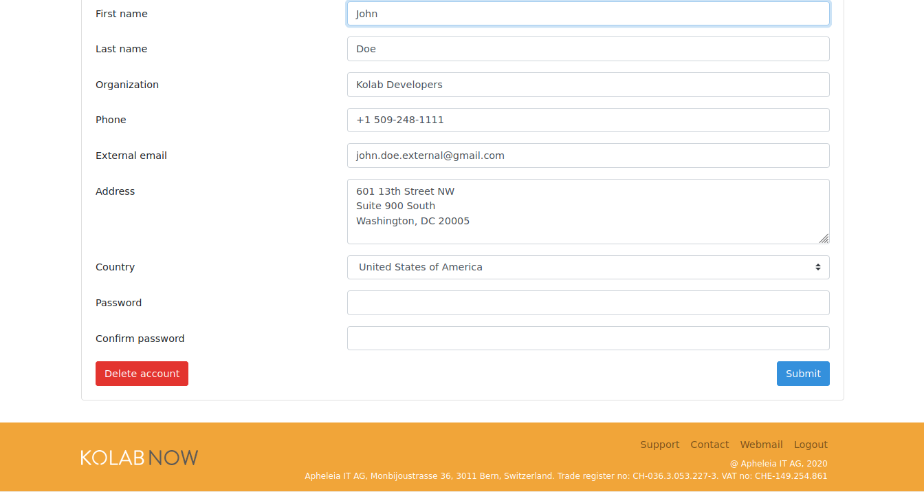
small ui polish for user list and view
improve dashboard layout
Differential D1453
small layout ui polish for user profile, user info, user list and dashboard Authored by bohlender on Jul 23 2020, 10:28 AM. Tags None Referenced Files
Subscribers
Details
small ui polish for user list and view improve dashboard layout
Diff Detail
Event TimelineComment Actions 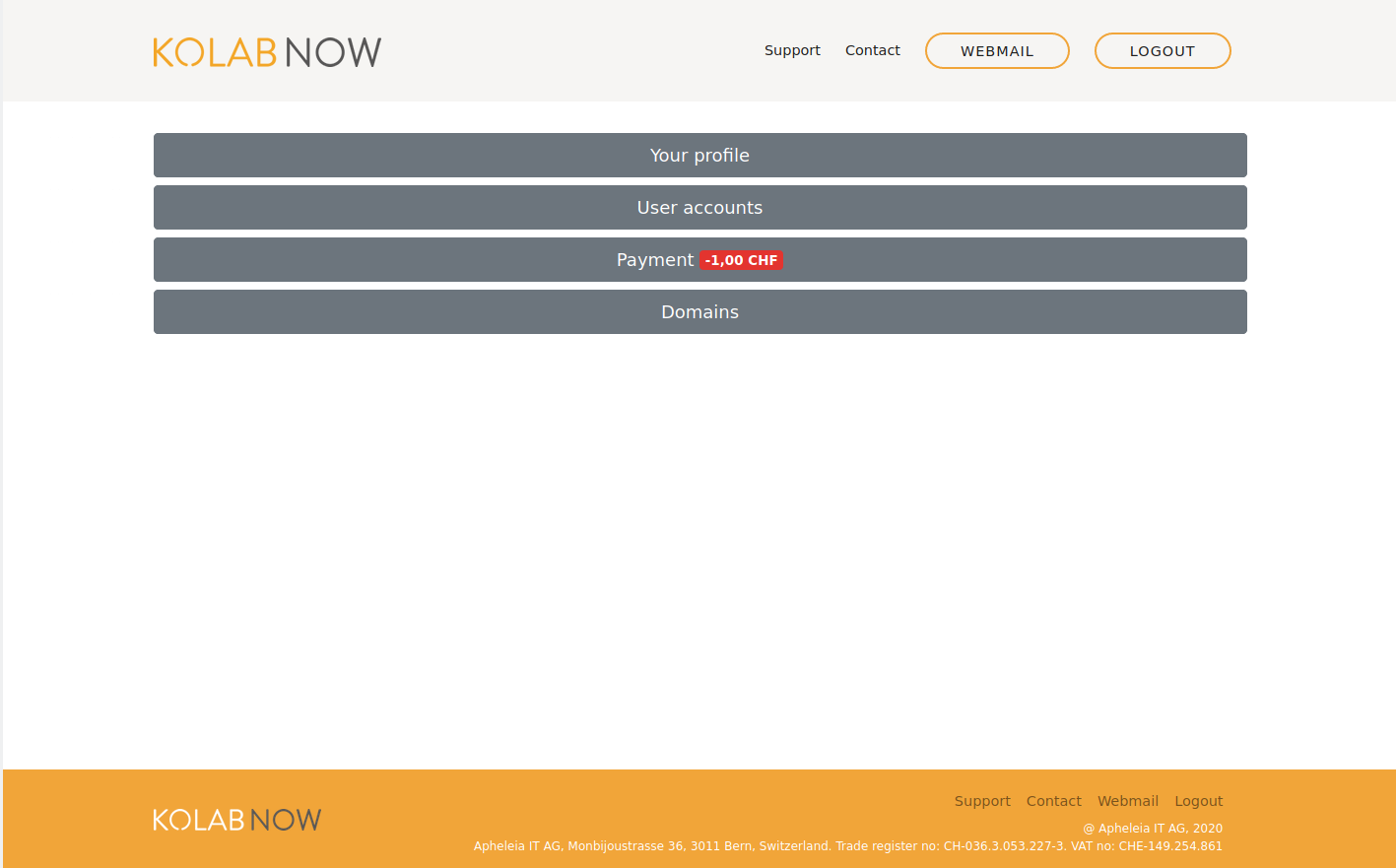 I don't like any of it.
Comment Actions It looks better once we include a link to webmail. 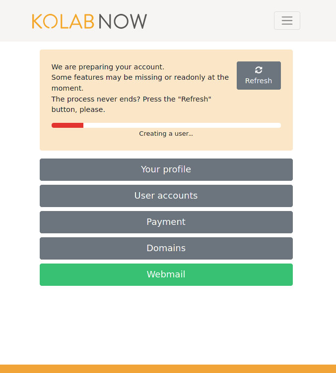 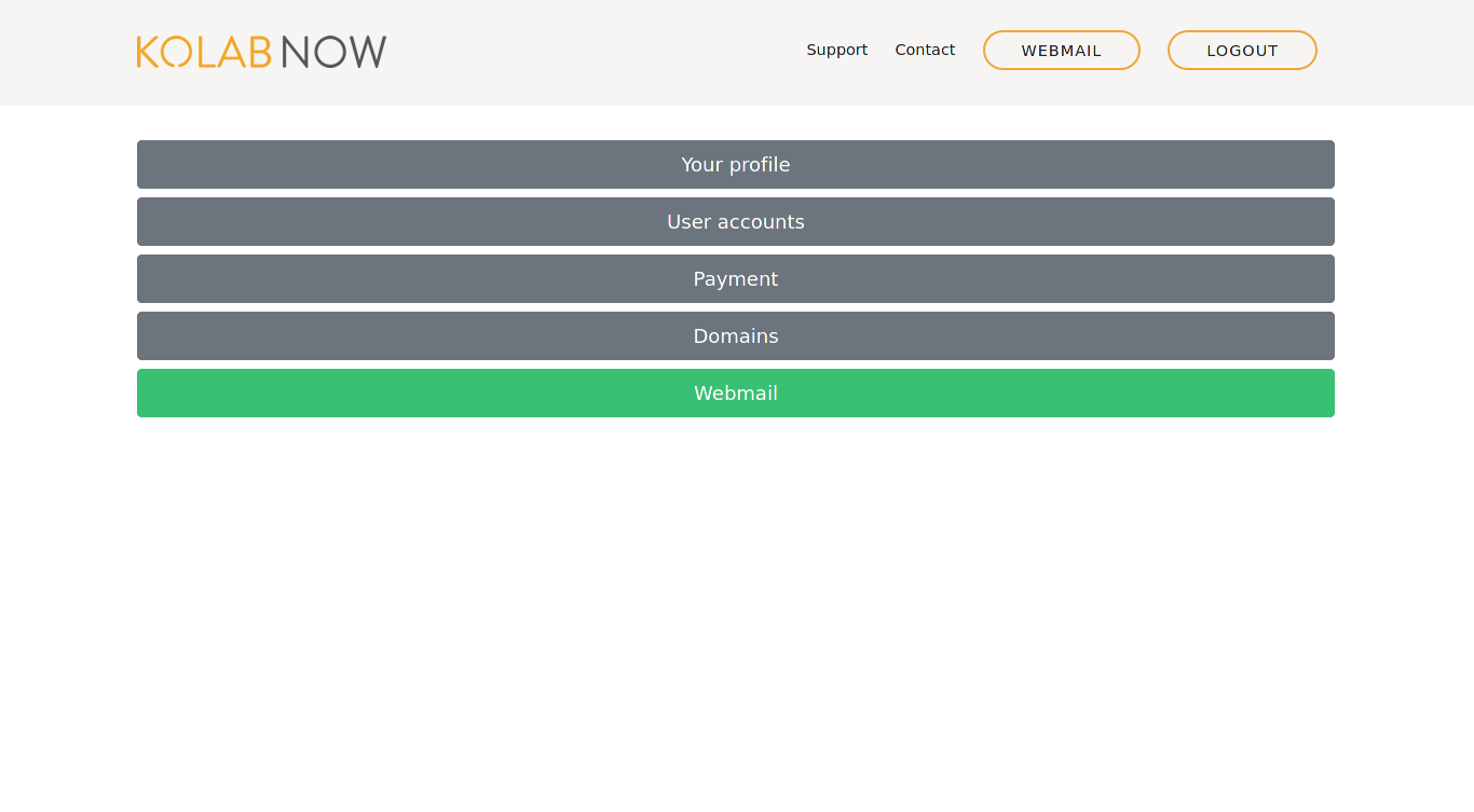
What is behind the button is things that have to do with payment which includes a history of payments and the possibility for future payments. I am not sure what you mean by not in place. As in not pixel perfectly aligned or does it just feel wrong?
Would this be fixed by increasing the right and left margins of the whole window on wide screen displays? It looks fine on my wide screen view. Can you give me a screenshot of your widescreen view ? The "OK" / "Submit" button should always be the last button in reading direction so bottom-right.
The idea is to use green for positive / creative actions in contrast to red for negative/destructive actions. Comment Actions We have Webmail link in the menu. And it still does not look so nice on a wide screen.
Feels wrong. Also singular "payment" feels wrong.
I would rather center the buttons, maybe with some greated space between buttons.
Ok, makes sense. That's the less problematic of all these. |